Color of the Year 2024: 11 Hues Predicted by Paint Manufacturers to Dominate Interiors
Color Trends 2024: From Peaceful Blues to Earthy Tones — Ideas for Every Space
The selection of the 2024 Color of the Year so far hints that while today's shades of green remain relevant, preferences might shift towards calming blue tones. In the forecasts for the coming year, you may notice a plethora of blue shades—from light and airy hues reminiscent of a misty sky to richer, bolder tones inspired by the sea and twilight. However, companies also offer numerous other options for designers seeking the most current color solutions.
The 2024 palette includes both light, transparent tones and heavier, earthy shades designed to set the desired mood in any space. Continue reading to discover how trend color forecasts can offer numerous ideas and inspiration for the upcoming year.
Next year's colors promise to become an encyclopedic collection of shades worthy of attention from design professionals. The colors marked as the 2024 trends open up limitless opportunities for creativity and self-expression through interiors. In the coming year, future hits might be colors that allow for the creation of both dynamic and energetic atmospheres as well as soothing and relaxing environments. The most popular shades will be those that enable everyone to find their perfect combination, whether it's in the decor of a living room, bedroom, or office.
Reading reports on color forecasts turns into an exciting journey through the world of interior design. Each color and shade they offer is not just a paint for walls but keys to the emotions these walls can evoke. As we approach 2024, both professionals and design enthusiasts can consider these predictions to stay at the forefront of stylish interior solutions, creating unique spaces that reflect the personalities and desires of their inhabitants.
1. Upward by Sherwin-Williams
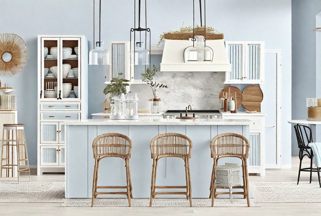
Inspired by the highest sky expanses, Sherwin-Williams' choice for the color of the year 2024 is Upward — an elegant shade of blue. This color is interwoven with subtle red undertones, showcasing a gray shimmer, complemented by hints of green that lend it familiar natural contours. Upward embodies tranquility and calmness, fitting perfectly with the philosophy of the Scandinavian "slow" lifestyle and the breezy lightness of coastal style. Depending on the context, Upward can bring elements of Northern minimalism into an interior or fill a space with the freshness of a sea breeze. This color is a valuable ally for those seeking to escape the exhausting pace of daily life and find harmony in the simplicity of being. Promoting the concept of serenity and measured existence, Upward becomes a symbol of balance and visually expresses the desire for seclusion and peace in the bustling flow of modern life.
2. Skipping Stones by Dunn-Edwards
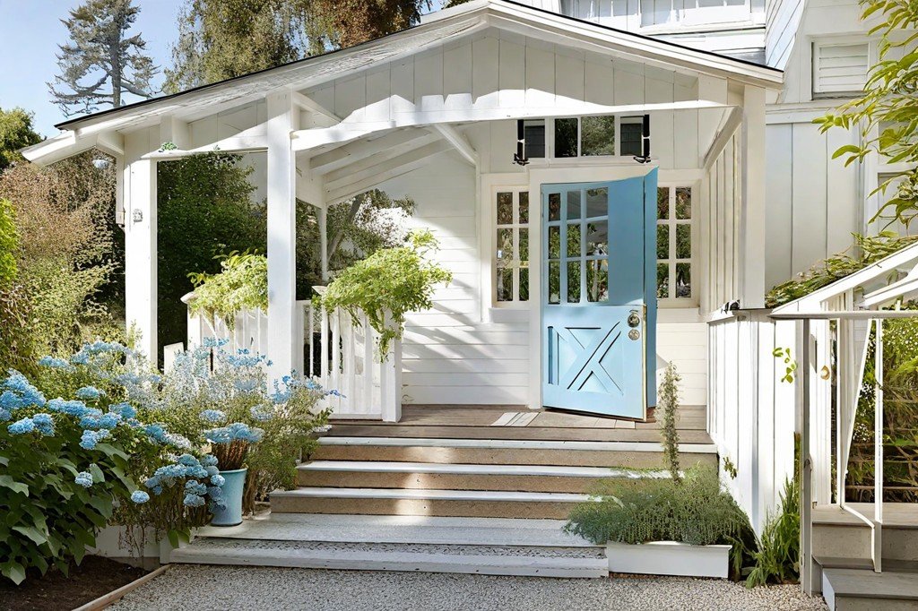
A similar but uniquely distinct shade compared to Sherwin-Williams' "Upward," the Skipping Stones color draws its hues from the depths of the sea rather than the open sky. As highlighted by Dunn-Edwards' color expert Deming Carpenter, this shade serves as "the perfect bridge between warm and cool tones." Melancholic and contemplative, this blue hue makes a welcome addition to any interior: it can adorn kitchen cabinets, room walls, or be used in more subtle, elegant design touches. Additionally, it seamlessly integrates with the "New Dawn" color collection, inspired by natural beauty, contributing to the brand's extensive palette and design trends for 2024.
Skipping Stones transports you mentally to a place of solitude, where you can listen to your thoughts and touch the mystery of the ocean depths. This color allows living spaces to breathe, filling them with the same freedom and infinity often sought at the seashore, watching the endless rhythm of the waves. It brings a sense of coolness and freshness, essential for balance in contemporary life.
A deep yet soothing blue-gray, Skipping Stones creates a sense of interior harmony, combining versatility with exclusivity, making it suitable for various design styles: from minimalism to classic and modern. This color is a confident choice for those wishing to imbue their home with the tranquility of a serene seascape while staying on the cutting edge of contemporary design trends.
3. Limitless by PPG
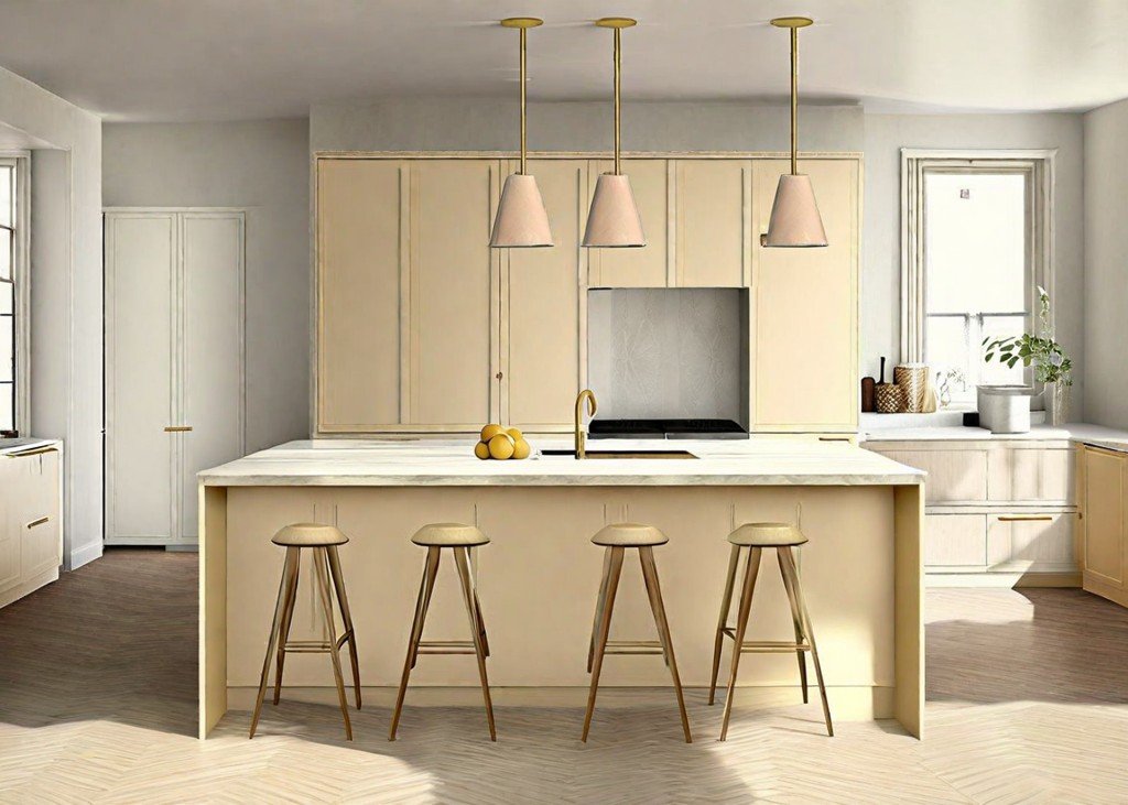
Limitless is a color that truly lives up to its name. This light-yellow shade radiates energy and optimism, embodying cheerfulness itself. Ashley McCollum, a color expert from Glidden, part of PPG, describes it as a "modern honey beige," and this is no exaggeration. Its remarkable ability to serve as a neutral backdrop makes this color genuinely versatile. However, it stands out distinctly from the cool gray tones that have dominated design trends in recent years.
The warmth of this shade can be compared to the morning sunlight, filling spaces with a sense of well-being and comfort. Limitless evokes associations with the refined decorative traditions of historical epochs while remaining at the forefront of contemporary trends. The application of this color is so comprehensive that it can rejuvenate any space — be it walls, kitchen cabinets, or any other interior elements that require a bright yet sophisticated touch.
Limitless is not just a background shade; it is a color that offers boundless opportunities for creative and design solutions, while maintaining a warm ambiance and harmony within a space. It can bring a touch of freshness and novelty to any interior, highlighting its uniqueness and distinctiveness. Thus, the color Limitless does not confine but rather opens up new horizons for experimentation and self-expression in the world of interior design.
4. Viridis by Graham & Brown
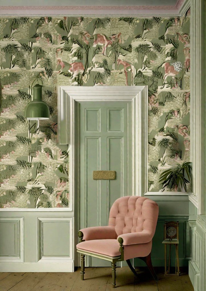
Viridis is Graham & Brown's 2024 Color of the Year, embodying a delightful garden of earthy green shades. The captivating combination of Viridis harmonizes with the richness of the New Eden forest landscape — the brand's Design of the Year, grounding the rich jewel tones of its illustrated plants and animals. Yet, Viridis itself possesses a unique power: it masterfully accentuates the beauty of dark wood, soft decor, and a plethora of adjacent green shades.
This color serves as a full-fledged character in the drama of contemporary interiors, transforming any space into a work of art. Inspired by the natural and organic essence of nature, Viridis reflects the inexhaustible vitality and deep tranquility of lush greenery. Using this color in design aims to create an atmosphere of freshness and naturalness, emphasizing a commitment to natural beauty and sustainability.
Moreover, Viridis promises boundless possibilities for combinations. It can serve as an accent backdrop for vibrant accessories or become the main tone, setting the tempo for the entire color palette of the interior. Undeniably, Viridis symbolizes a new beginning and a return to roots — to the pristine beauty of nature that rejuvenates and restores, giving spaces a deep sense of harmony and tranquility.
Thus, it’s no surprise that this color has been recognized as the color of the year. It effortlessly brings any design dreams to life, creating an oasis of coziness and calm in any room, filled with the call of nature and its rich, life-giving force.
5. Cracked Pepper by Behr
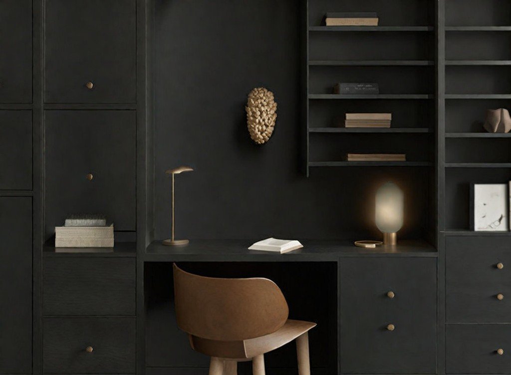
Behr’s chosen color of 2024 is a decisive return to black, an unexpected move in an era dominated by light and nearly neutral tones. The luxurious "Cracked Pepper" tone emerges, proving that even dark shades can create an atmosphere of softness, coziness, and comfort without losing their distinct character. This color becomes a reliable accent in modern-style interiors or an elegant touch in classic design, richly enhancing any space.
There are numerous arguments favoring why "Cracked Pepper" from the Behr Designer Collection Palette stands out as a bestseller and rightfully earned the title of Color of the Year. This shade transforms ordinary spaces into striking and unforgettable ones, infusing them with elegance and modernity. With "Cracked Pepper," one can achieve a unique balance between classic and innovative, between the coziness of home and impeccable style, which justifies its recognition as Behr's Color of the Year.
6. Blue Nova by Benjamin Moore
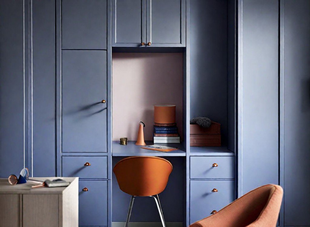
The color known as Blue Nova by Benjamin Moore is a unique shade of blue that astonishingly combines warmth and coolness. Andrea Magno, Director of Color Marketing and Development, described Blue Nova as a "captivating, otherworldly" shade that captures the spirit of twilight and can create a truly magical effect. The matte finish of this color allows surfaces to have a "velvety" feel, valued by Magno for its tactile qualities. Yet, it’s also its versatility—Blue Nova is not only pleasing to the touch but also capable of adding an element of accessible excitement and enlivening spaces, whether it be a kitchen island, cabinet fronts, or even entry doors.
This shade of blue is perfect for bringing a sense of peace and harmony into any interior. Its versatility also allows it to introduce a certain energy to the space. Using Blue Nova serves as an invitation to dream and reflect in low lighting, while also acting as a fresh and bright accent in daylight. Therefore, choosing a shade for your space can be a simple solution to transform the ordinary into the enchanting and extraordinary. In any case, Benjamin Moore's expert believes that this color has a unique ability to make people fall in love with their surroundings over and over again.
7. Renew Blue by Valspar
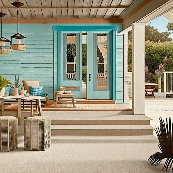
Struggling to choose between modern shades of green and futuristic blues for tomorrow? Don’t get caught up in this duality. Renew Blue – the color of the year 2024 from Valspar – finds a way to reject this artificially imposed dilemma. As its name suggests, this shade is designed to restore balance and bring a sense of renewed energy, wonderfully blending a feeling of peace with a challenge to the ordinary.
Revitalizing Blue pairs beautifully with neutral tones such as "Perfect Background" and "Sunset Valley," yet it can also stand out impressively on its own, not requiring any additional combinations. Whether you use it in your interior as an accent or a foundation, it will undoubtedly transform any space into a place where everyone can discover and express their true individuality. "Revitalizing Blue" possesses everything needed to turn a house into more than just a living space but rather a haven for personal reflection, a place where every corner is filled with personal meaning and harmony.
8. Bay Brown by York Wallcoverings
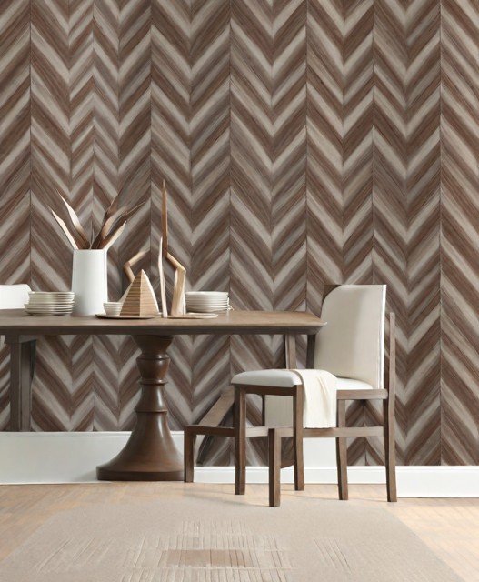
York Wallcoverings' Color of the Year for 2024, Bay Brown, encapsulates the rich fertility of the earth and the elegance of high-quality leather, reminding us that nature's palette includes more than just greens and blues. This distinctive neutral color embodies solidity, making it an ideal choice for classic design solutions. However, its depth is so expressive that it also perfectly suits the creation of unique atmospheres in modern, character-filled interiors.
This color possesses a unique quality: no matter where it is used, it brings with it a sense of tranquil yet undeniable luxury. Bay Brown is like soft music that evokes deep emotions, elegance without ostentation, effortless chic that doesn't require additional embellishments. Thus, using this color is not just a decorative element—it's always a choice in favor of a refined, thoughtful style that gives space an exceptional and sophisticated feel.
Therefore, Bay Brown is not just a color choice; it's an invitation to create an interior where everyone can feel part of something more significant and inspiring—whether it is a classic decor or a design in the spirit of modern trends.
9. Sweet Embrace by Dulux
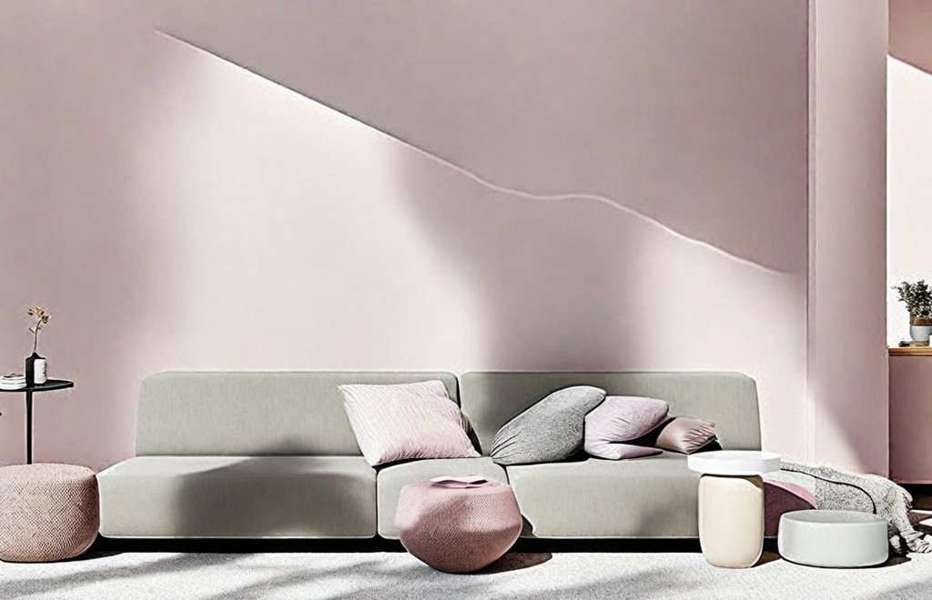
Painted in soft, soothing shades, Sweet Embrace by Dulux is the embodiment of gentleness and positivity, exuding warmth and hospitality. This color, gently shifting through lavender hues towards neutral tones, can fill even the most secluded corners of a home with light, where sunlight rarely reaches. It can serve as the foundation for creating an oasis of calm in a home office or become a transformative accent, bringing freshness to the overall color palette of a room.
Regardless of whether Sweet Embrace pairs with greens and blues, earthy oranges, or soft golds, its light and airy characteristics seamlessly fit into any style and atmosphere of any season. It enhances the lightness and refinement of the interior, giving a sense of spaciousness and visual ease, making every decor element more expressive and noticeable. In every application, whether it be the main backdrop for a general space or an accent in design details, Sweet Embrace stands out as an inspiring choice that can be the key to creating a perfectly balanced and harmonious home environment.
10. Peach Fuzz by Pantone
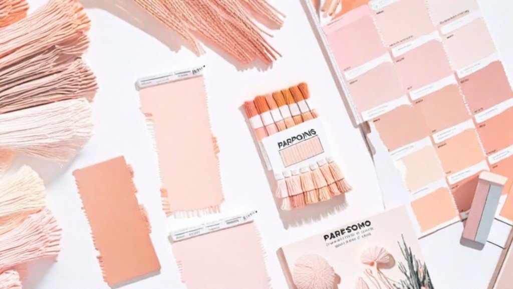
In 2024, with fashion trends leaning towards cooler shades, Peach Fuzz by Pantone becomes a warm and cozy element that brings balance. This shade can be utilized in home decor in various ways: for instance, as a rug that introduces pleasant tactile variety against more rigid surfaces, or as an accent wall in the dining room, where it will infuse a welcoming and warm atmosphere. Peach Fuzz fills the space with a sense of comfort, care, and connection, transforming any environment into a place where you want to relax and feel at home.
The color fits perfectly into a wide array of design concepts: it can stand out against traditional neutral tones while not getting lost among the modern palette of bright and bold shades. Pantone's Peach Fuzz can be found in various interiors, where it brings a sense of cool tranquility or serves as a source of creative inspiration. Its versatility and adaptability to different styles make this color a unique choice for the upcoming year. We can expect it to appear frequently in interior designs aimed at creating a relaxed and inspiring atmosphere.
11. Mountain Sage by James Hardie
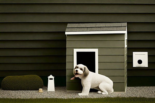
For the first time in history, James Hardie, a manufacturer of exterior building products, has announced Mountain Sage as their Color of the Year. This shade, touted as the most fashionable for exterior finishes, is richly saturated with neutral tones and earthy green notes, illustrating the idea that transforming your home into a haven of tranquility can start from the outside. Mountain Sage is available in James Hardie's range of siding and trim products. The color promises to convey a sense of calm and peace, while simultaneously blurring the lines between man-made spaces and natural landscapes.
Drawing inspiration from nature itself, Mountain Sage symbolizes a pursuit of harmony and well-being, allowing a building's exterior to aesthetically blend with the surrounding natural environment. Using this color in construction can be an effective way to visually bridge the gap between humans and nature, heralding a new era in residential design focused on creating more sustainable and eco-friendly homes.
Refreshing and serene, it allows the house to "breathe" and harmonizes with any landscape, while remaining elegantly modern. This becomes a vivid testament to James Hardie's ability to anticipate architectural trends and offer consumers not just building materials, but solutions that can enhance quality of life and contribute elements of sustainable development to the appearance of residential communities.
Mountain Sage smoothly transports us to a tranquil corner of nature, right at our doorstep. This color embodies the desire for peace and coziness, becoming not just a part of visual design but a powerful symbol of eco-friendliness and thoughtful interaction with the surroundings.